

A Letter For: The Process Part 2
Continuation of how I executed this project

With the READ ME figured out the natural next step was to figure out how we would execute the packaging, it needed to be simple and easy for me. The letters themselves are so much work, by the time I finished typing I needed to be able to run through the assembly line of packaging to get them out the door.
My first item I documented was the packaging itself, someone the design process led us away from this at first but now was the time to solve it. The process works this way sometimes, it’s both linear and non-linear.

The linear process is often just a framework for actively keeping the process going. If your stuck, go to the next step, be intentional, make progress. It’s also a place to start and end, which helps with starting and ending (duh).
This is no trivial matter though as simple as it seems, those are the hardest gates to pass through. You need to know how to start and just start. You also need to know when you should end, stop tinkering, and take action. Trying and testing is such an important piece to making things better, if you never get there you can get stuck again easily.
The non-linear process is really just a way of being. If you have the process in motion and framework there for structure and support, you can allow the inputs you are open and aware of to change any piece at any time if it FEELS right. All along the journey you can adjust, tinker, and adapt, it’s all a choice. KNOWING that you have that choice is powerful, the most powerful actually, but it can’t be taken lightly. Of course we make the best decisions when we are best informed and most in-tune with ourselves.
I digress. We needed to finalize the packaging and a system for packaging up a letter quickly once completed.
Here is what we knew we needed at the time:
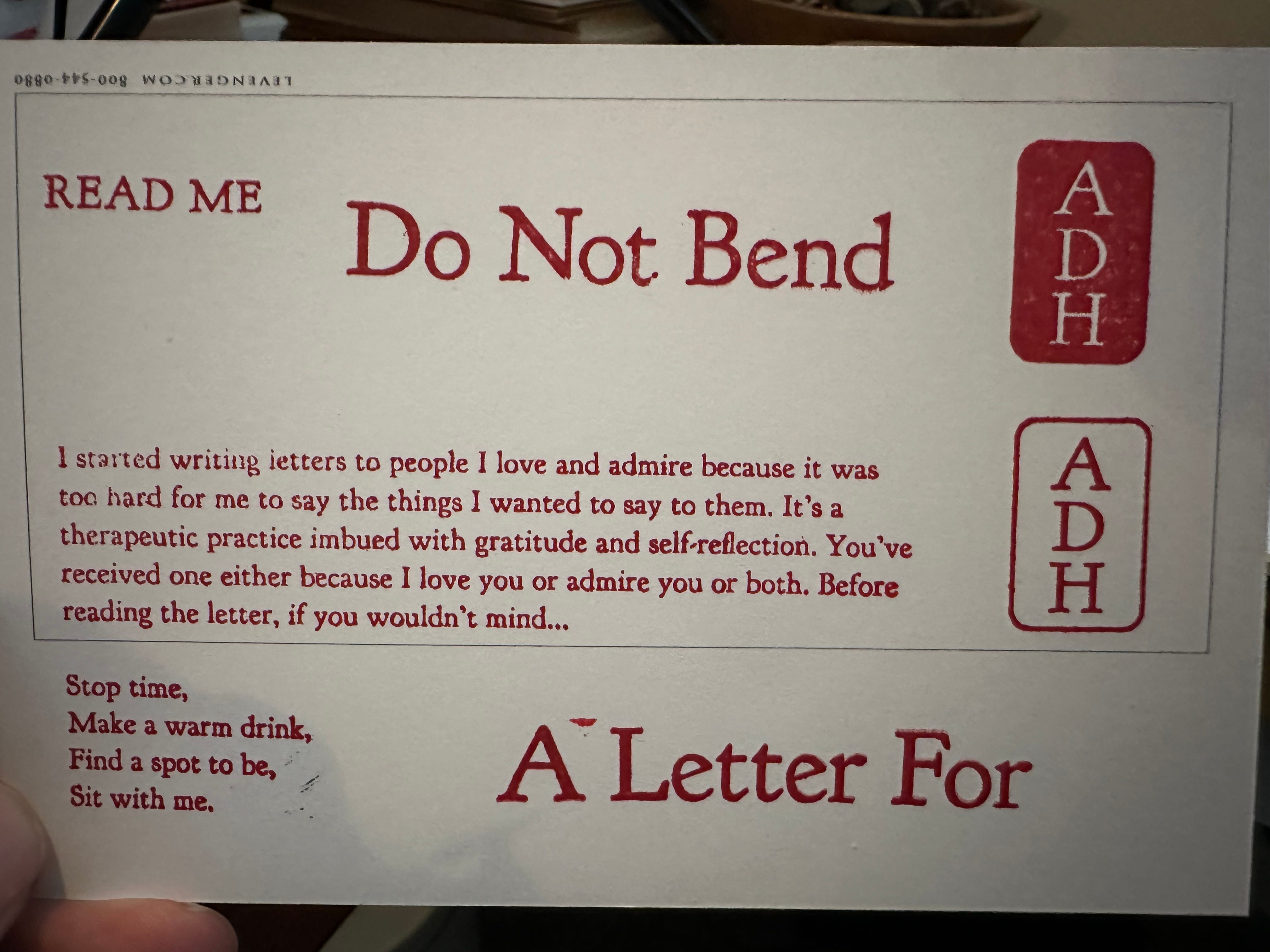
A durable and elements-proof outer envelope/package for protecting the contents inside that is ALSO bright and attention grabbing (they have to know it’s important from the moment they see it and handle it.
A TO: and FROM: solution for that outer envelope
An Inner sleeve or envelope for the letter to go in. It needed some heft and weight to make it feel important.
A way to brand that inner sleeve/envelope so that it looked beautiful (A primary mark)
A way to make it feel personal, an official addressing of the receiver
A mechanism to seal the inner sleeve/envelope
Carefully engineered way of opening the entire thing, a stepped process that guided the experience
A way to make the letter itself feel so so special
This was a lot, but in reality was easy at this stage of the process. We had most of this in motion in some form, we just had to nail it down and get to the point of being able to do one letter and have it be great. So we marched down a path to knock it out quickly:
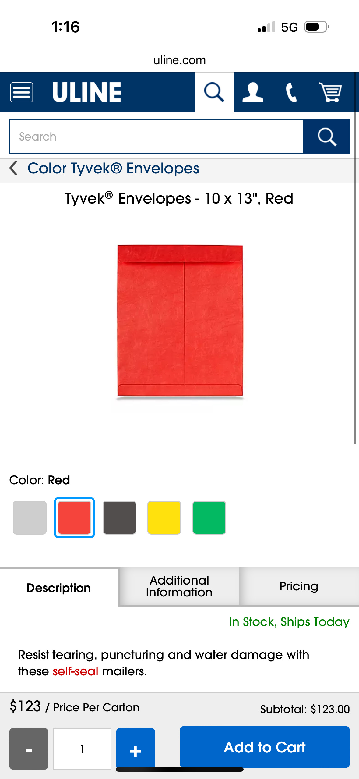
OUTER ENVELOPE: Tyvek mailers. Waterproof and very durable. We would just use stickers that we could print labels onto for the TO: and FROM: in the project typeface.
INNER SLEEVE/ENVELOPE: Heavy, thick craft paper was where we were first drawn. Some online research was done on how traditional sealing and letter packaging was accomplished. Here are the results:

This guy is talking about the art of letter writing (Rajiv is amazing and has a A++ youtube channel, highly suggest you follow him):
This is about letter locking, not super relevant to your project but interesting:
https://www.ancient-origins.net/history-ancient-traditions/letterlocking-0016818
Letter Writing and Epistolary Culture (the title makes you want to read it, right?
This guy is talking about personal seals:
A Japanese seal is called a hanko:
https://tokyocheapo.com/shopping-2/hanko-japanese-personal-seals/
https://pigment.tokyo/en/blogs/article/seal-engraving
This is research really did the trick and started tying it all together. We found some great craft paper envelopes with a strong enclosure and decided to use a wax seal to secure it and make it look extra special. We started with these designs for the wax seal:

Then refined down to this:

With this being all one color and utilizing negative space, we landed on 1 & 3, because they only had 1 ring, we felt 2 rings would be too much on a small format seal. We ordered both to try along with 2 colors of wax beads to test the red. Here were the results:
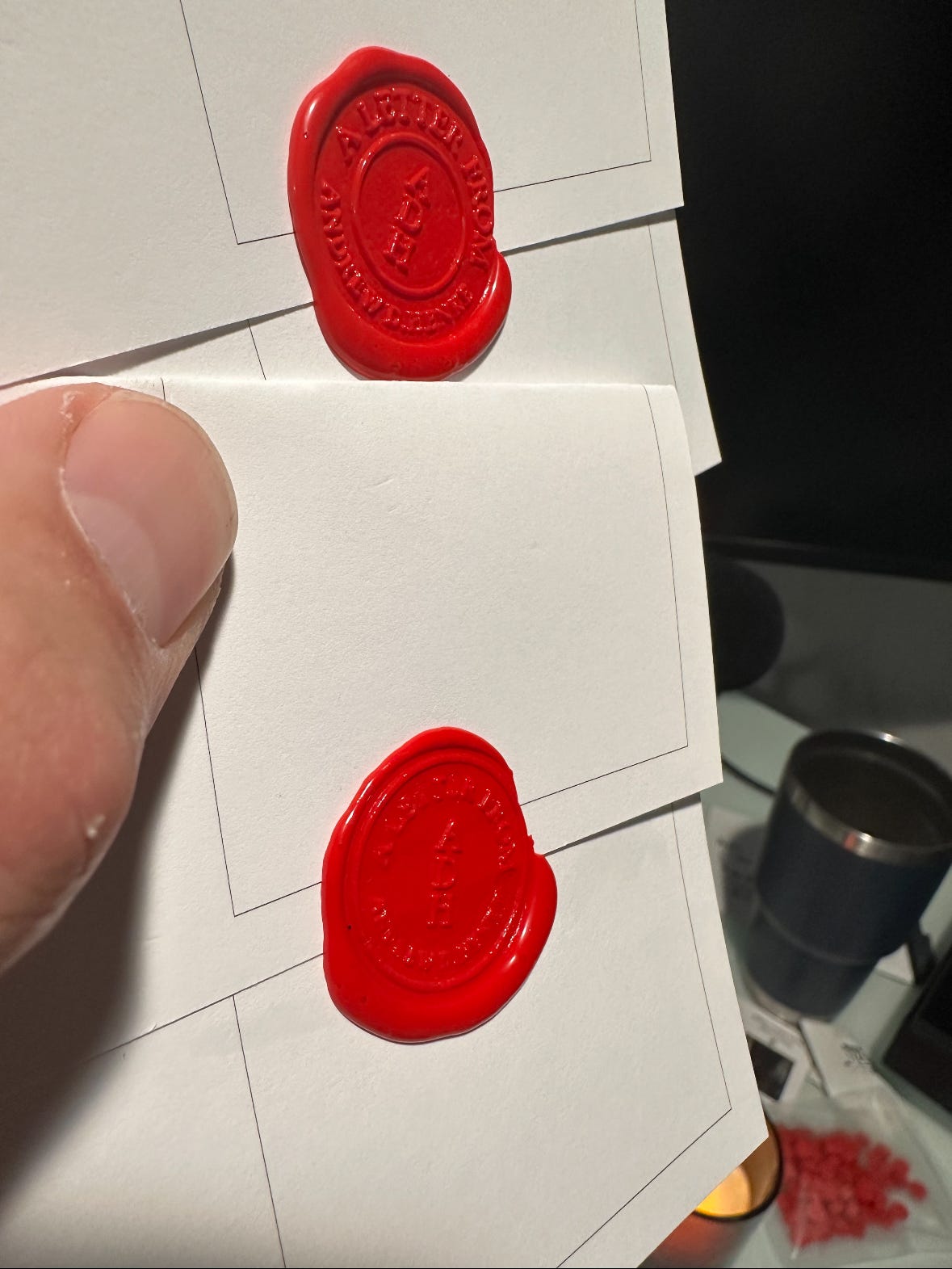
To be honest, I still haven’t decided which one I like best. I lean towards the top one because of that clean inner ring that separates the initials and highlights them. Maybe I just made the decision now while typing this, sweet.
The idea of using a seal and a stamp led us to realizing the key to making this reproducible and fast to package up was stamps.
This was a great decision, now we just needed to decide on the marks and what needed to be a stamp and get them ordered.
Once we got to thinking about stamps an idea came up to also stamp the letter pages with a personal mark. It seemed best to just use the name and typeface for that. The personal mark was inspired by a traditional Japanese Hanko (I lived in Tokyo for 3 years and love most things Japanese). At this stage we hadn’t officially chosen the typeface, so we made quick work of that:
With that out of the way, the marks and stamp designs were painless.
The initial designs:

After some very quick collaboration and iteration, it was clear that the official mark just needed to be the project name “A Letter For” and the Hanko stamp should be traditional and vertical and be negative space for the initials. When things feel clear, the decision making can be so swift and unencumbered, the first attempt at the primary mark was what we went with:

We also quickly decided on what else should be a stamp: a READ ME stamp for the readme poem envelope, a stamp for the actual poem itself, a DO NOT BEND Stamp for the bigger envelope, and the Hanko Stamp.
The final stamp results:
To highlight how amazing the Hanko stamp is, here is what it looks like on the antique linen paper (Southworth, 25% cotton fiber, 24 lb, Ivory Linen) that I write the letters on:
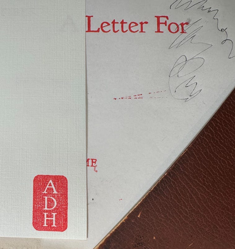
The way the texture of the linen paper and the red ink combine is magical, absolutely stunningly beautiful.
This is really it, the process had run its course and all of the problems had been solved. The last part of this was to package it in a way that guided the receiver through in the exact manner needed to get the full experience.
Unfortunately I ran out room in this post to do that, so head to The Process Part 3: The Final Package